Our 25th anniversary in 2022 marked not just a milestone, but also the beginning of exciting developments in our practice. We welcomed a new generation of principals, strengthening our leadership team with fresh energy and perspectives. We also grew, exceeding 50 people for the first time, and made the SFBizTime’s list of Fastest-Growing Companies in the Bay Area.
It was the right time to examine our mission, vision, and values in the context of our changing world and the impact we want to have in our communities. Through an iterative series of open and honest conversations — along with insights from a survey of clients, collaborators, and staff — we considered all aspects of our practice, taking stock of where we’ve come from and our collective aspirations for the future. With renewed clarity of purpose, we partnered with brand consultants Karin Bryant of KB Creative and Jessica von Rohr to unlock a fresh articulation of who we are, what we do, and why it matters.
At the heart of our identity is a focus on creating places that connect people. This has been the enduring motivation behind our work since its founding, and it remains a guiding tenet as we navigate change and disruption with agility, innovation, and compassion.
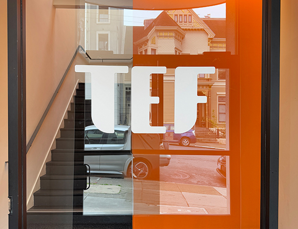
Today, we’re thrilled to introduce our new brand identity and share a quick behind-the-scenes glimpse into its design.
![]()
More than a logo — a strategic evolution
We set out to reimagine our brand identity in a way that would infuse the core tenets of our practice with our newly articulated brand story. As we do in all our work, we grounded ourselves in our core principles to develop an identity with meaning built in. First, we simplified our name to TEF (removing the word “Design”) as a reflection of our growth and establishment in the community.
Our visual design exercise was inspired by one of our four brand pillars: Process is our superpower. We’re well known for our robust and inclusive approach, bringing project stakeholders together to ensure key voices are heard and placing exceptional partnership at the core of our practice. The result is an expression of our evolution with a look that is confident and approachable.
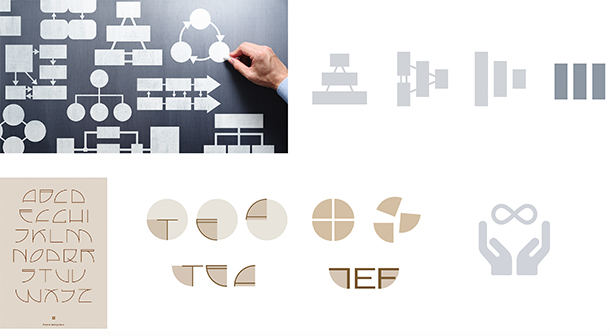
Rounded corners are a reference to the circle – a connection to the old logo – as well as the universal symbol of inclusion, unity and community embodied in our values and our brand promise: We create meaningful places through an inclusive design approach. Its curves also impart an open, friendly, and warm energy that captures our ethos: We care about people and nurture our relationships.
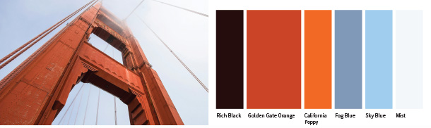
A sense of place
Our reimagined color palette – inspired by the Golden Gate Bridge and the surrounding environment – reflects our deep roots in the San Francisco Bay Area and California. A fresh take on our signature orange, it also acknowledges our contextual approach to design, connection to place, and our commitment as stewards of cultural heritage and the planet.
More to come
We’re deeply grateful to staff, clients, collaborators and friends who contributed to this process in large and small ways, and can’t wait to continue building our brand together. Stay tuned as we share more about our rebrand work, and the underlying values and vision that inspired it, in the coming months – including a brand new website later this year!